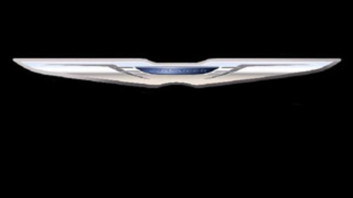
Low-resolution, grainy and barely recognizable--sounds like a spy photo of a top-secret supercar in testing. But this time, it's a new Chrysler logo, dug out of the depths of the United States Patent and Trademark Office (USPTO).
The logo, which seems oddly compressed in the vertical axis, is a sort of retro-modern combination of the winged Chrysler logos of the 1990s with a modern typeface and the Chrysler name. It may be yet another visible aspect of the Fiat restructuring and rebranding of Chrysler, though the symbol also bears at least a passing resemblance to Aston Martin's famous winged icon.
Chrysler is no stranger to the whole musical logos game, however, of late a procedure that's tended to coincide with purchase or sale by a parent company, i.e. Daimler. The last such change saw the withdrawal and then reinstatement of the Pentastar logo, which once again appears to have gone the way of the dodo, or the Pontiac, as it were.
An interesting note: the date on the file is from July 2, 2009. That means this new logo has been in the works behind the scenes since the earliest stages of the official merger of the two companies, which was finalized in early June.
