


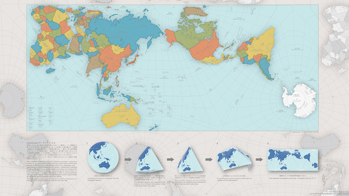
This new map shows the world as it really is. (Courtesy AuthaGraph)
The Japan Institute for Design Promotion has awarded its prestigious Good Design Award to a map that completely changes our perception of the world.
Given that the planet is a sphere, representing it in a two-dimensional rectangle is rather difficult; in fact, the most commonly used map, the Mercator projection, warps the sizes of the continents.
Japanese designer Hajime Narukawa sought to resolve the problem once and for all with the AuthaGraph map, which, while unusual to the eye at first, is actually a near-perfect representation of the world. He succeeded in designing such an accurate depiction by dividing the globe into 96 regions and transferring them to an inflated tetrahedron (a pyramid-like structure).
More from Architectural Digest
Tour the World's Most Luxurious Submarine Superyacht
Go Inside a $53 Million Private Jet
Inside Jennifer Aniston's Gorgeous Beverly Hills Home
10 Awesome Hotels in California’s Wine Country
10 Hotels with Unbelievably High-End Amenities
Once the tetrahedron is flattened, a rectangular map can be obtained that maintains an accurate ratio of land and water. So while the Mercator projection typically shows Greenland to be the same size as Africa, the AuthaGraph displays their scale correctly—Africa is approximately 14 times larger than Greenland.
Though perhaps not the most useful map for navigation, it certainly helps you grasp the true sizes of countries around the world.