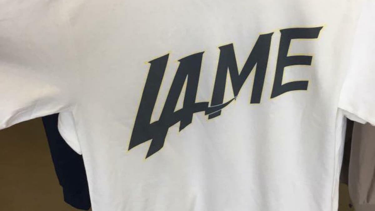
Like many of us in the sporting world, the good folks at Roush Fenway Racing weren't too impressed with the "new" logo initially trotted out on social media for the NFL's Chargers who are leaving San Diego to begin playing in Los Angeles.
For those blissfully unaware, the logo the new L.A. Chargers trotted out on Thursday looked almost identical to the Major League Baseball logo already sported by the Los Angeles Dodgers.
A FOX Sports L.A. correspondent later received confirmation from the team that the avatar widely distributed on Thursday is not, in fact, the new logo for the team but instead just a marketing element for now. And as of Friday, the colors in the logo being pushed out by the team on social media had been altered, with a white background in the letters being replaced by the team's more traditional yellow.
Some have suggested that the statement from the team and the switch to new colors in the logo were in reality done in response to the negative backlash the announcement and logo generated.
But with all of that in mind, the social-media team at Roush Fenway went to work having a little fun with it -- reworking its current logo to see what it would look like if patterned instead after the logos of several of NASCAR's other top teams.
The RFR social team even offered up a "new" logo that looks just like the one already being used by Team Penske.
Hey, at least they're both organizations that field Fords in NASCAR, right? They're supposed to share technical information but word on the street is that Penske is a little stingy with that (hence, the vast difference in performance between the two), so maybe they can at least share a logo.


