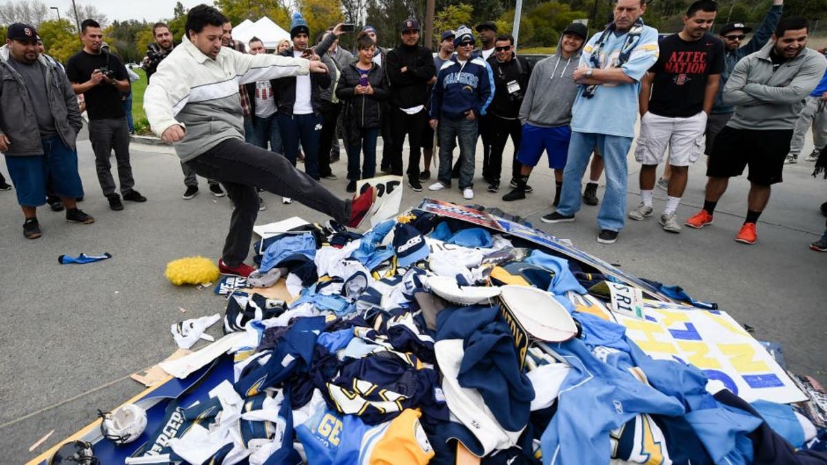
Chris Githens, left, kicks a pile of Chargers memorabilia in front of San Diego Chargers headquarters after the team announced that it will move to Los Angeles Thursday Jan. 12, 2017, in San Diego. (AP Photo/Denis Poroy)
Shortly after the Chargers announced their move to Los Angeles on Thursday, the team unveiled a "new logo" on Twitter that was universally ridiculed by the online masses.
Within hours, multiple reports indicated that the white-on-blue, lightning-based logo was simply a placeholder -- a marketing tool to help launch the new brand. Yet in the face of all that trolling from NFL fans, the Chargers unveiled another logo one day after debuting the first. This time, the mark was the same, only the colors were more reflective of the Chargers, with the LA logo mocked up in gold and powder blue.
Even that wasn't enough for the franchise, however, as the team unveiled a third Los Angeles-based trademark before the end of the day on Friday.
Finally, on Saturday, Chargers president of business operations A.G. Spanos explained just what happened in a statement provided to NBC Sports.
"The logo that was revealed on Thursday was meant to help launch our brand into the market and supplement -- not replace -- our official team marks," Chargers president of business operations A.G. Spanos said in a statement provided to PFT. "Clearly, we miscalculated how the logo would be received, and we've taken it out of the rotation."
A.G. Spanos emphasized that this is the identity of the team. "If we make a mistake, we own it, learn from it, and move on without looking back," he said.
"If the ultimate outcome of this episode is something really special that L.A. fans help create and truly love, that's a win," Spanos said.
Really, though, you have to appreciate the Chargers taking fans' feedback into account. This is an opportunity for the organization to make the most of a bad situation, which starts with a clean slate across the board.
So if you're listening, Los Angeles Chargers, we will say this one more time: please, please, please make the powder blue the primary color for your jerseys, logo, and basically everything Chargers-related moving forward. It's simply the best.


