


Funky features on Tesla's Cybertruck
With a bulletproof body and 500-mile battery-powered range, Tesla's electric pickup isn't like every other truck.
When it comes to car company logos, Tesla’s is about a straightforward as they get. Or is it?
(Tesla)
It looks like the letter T, which makes sense, but there’s more to it than that.
According to CEO Elon Musk, it’s a stylized section of the cross-section of an electric motor that represents a section of the stator and rotor that comprises one.
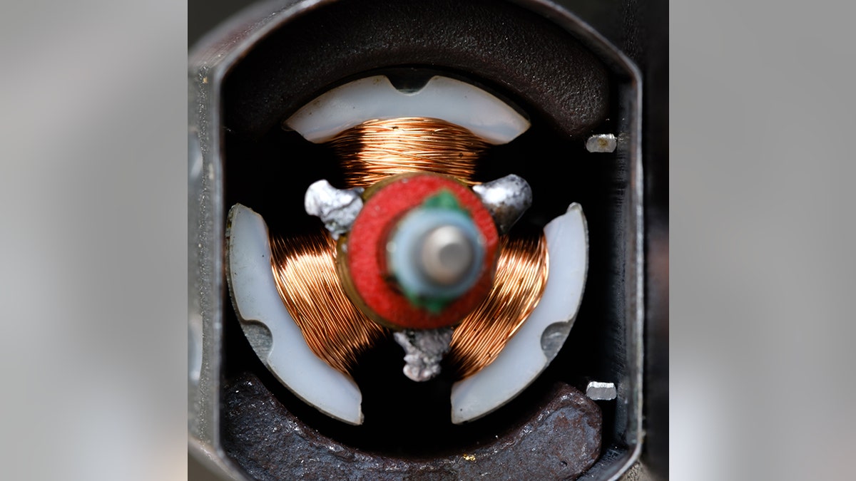
(iStock)
The main part of the T is one of the windings on the rotor while the line above it, separated by a space, is the stator. Neat.
Avishek Das/SOPA Images/LightRocket via Getty Images
Tesla isn’t alone among Musk’s companies to incorporate iconography into its branding. The curved line in the SpaceX logo is supposed to be the trajectory of a rocket taking off, while the black O in the tunnel-drilling The Boring Company’s logo isn't very exciting. It's just a hole in the ground.

MARK RALSTON/AFP via Getty Images
Or is it?