


Now you can actually see how travelers crisscross the globe.
Michael Markieta, a Canadian GIS consultant for the global engineering and design firm Arup, spent a year tracing some 58,000 routes on major and regional airlines around the globe using geographical information systems technology to create flight path graphics.
Marketa's map shows relatively faint blue lines for each individual route and bright white nodes where multiple routes intersect or overlap.
While the world's busiest airport is in Atlanta, Georgia, Frankfurt International was found to have the most connections. Sao Paulo, Beijing, Sydney and Cairo were the other busiest airports by continent.
Markieta began to work on visualizations in his spare time, using the data at the open-source project openflights.org. He hopes that the project will prove useful to researchers in various fields needing to understand more about global connectivity.
Arup contends that climate change is a threat to the aviation industry, with 150 airports at risk of sea level rise.
1. Busiest U.S. Airports
(Michael Markieta/ Arup)
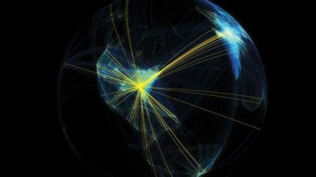
Georgia's Hartsfield-Jackson is the world's busiest passenger airport in the world. The amount of flights landing and leaving are shown by the yellow lines. But the Washington-New York-Boston corridor appears to be the most heavily traveled overall. The densely populated flight paths of Europe can be seen by the flash of white in the top right-hand corner.
2. North America

(Michael Markieta/ Arup)
Many long-haul flights leaving North America are shown as dark blue lines travelling into New York and Atlanta. The shorter, domestic flights are shown in white.
3. Europe

(Michael Markieta/ Arup)
Here is the outline of Europe, with Frankfurt International, the continent's busiest airport, at the center. It has 235 direct-flight destinations.
4. Africa
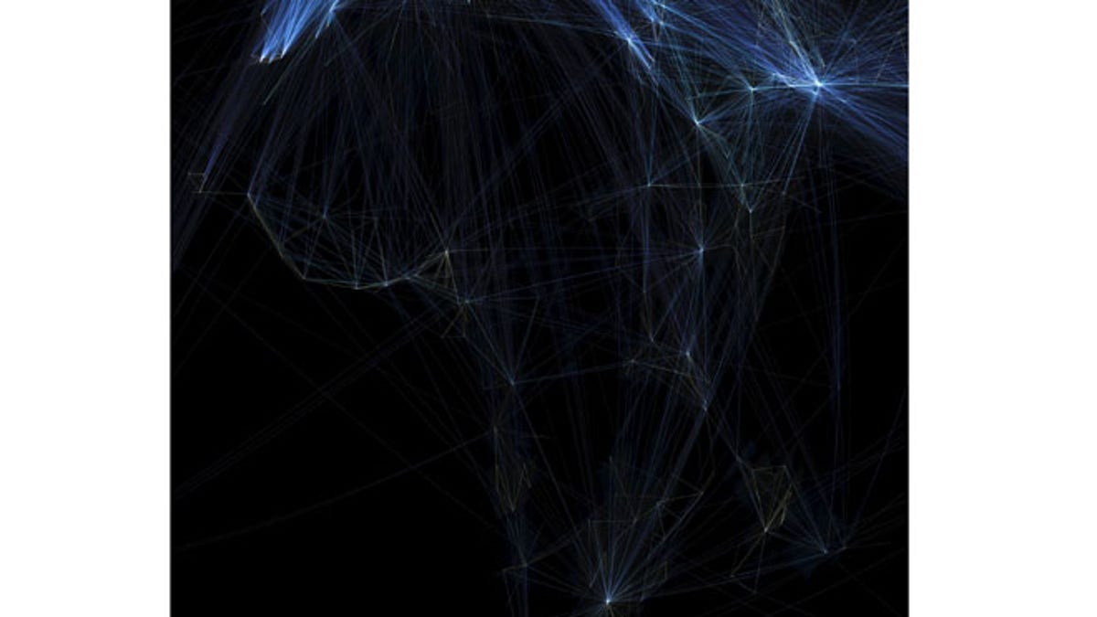
(Michael Markieta/ Arup)
You can spot the outline of Africa in this image, created by the flight paths across it. Egypt is on the far right, which is the most popular destination on the continent. The bright white dot at the bottom of the image is Johannesburg.
5. Asia and India

(Michael Markieta/ Arup)
Markieta didn't need to apply a base layer to the images because the flight patterns traced the outlines of the continents. On this image, you can see Asia and India, as the paths create an outline of those countries. The densely populated, white section in this image show the flights to and from Beijing in China.
6. South America

(Michael Markieta/ Arup)
This image shows that flights to South America were much less densely populated than other countries. Sao Paulo - which was the busiest airport in the region - and Buenos Aires in Argentina are the two hotspots on the continent.
7. Asia and Down Under

(Michael Markieta/ Arup)
Australia, New Zealand, and Asia, to the north, can be seen. Beijing is shown in the center. Flight paths to Australia and New Zealand are less densely populated, although Sydney can be seen as the white dot visible at the bottom of the globe.
8. The World
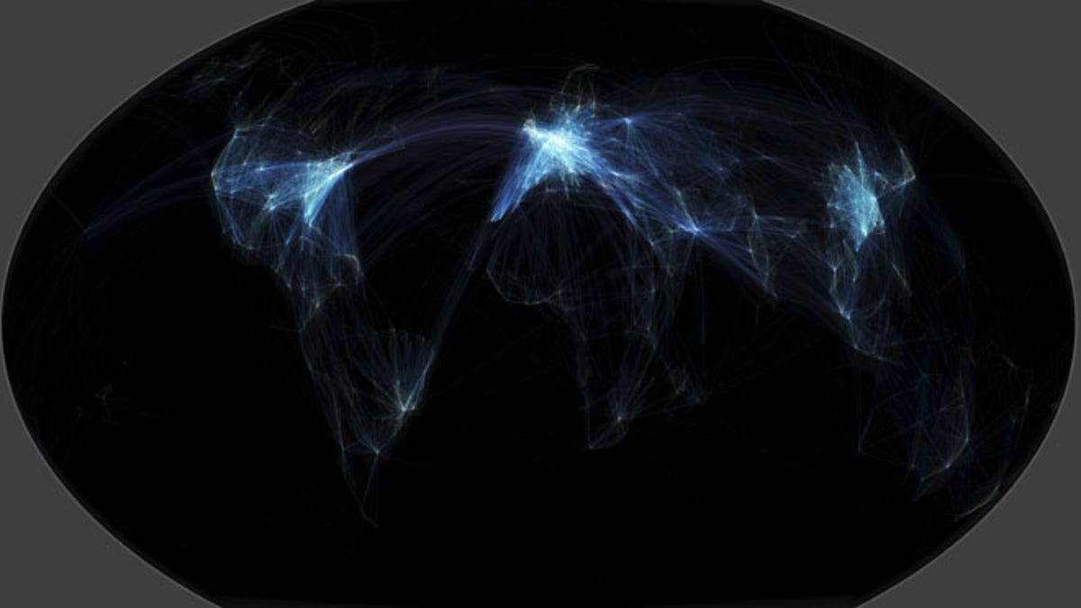
(Michael Markieta/ Arup)
This map shows all these flight paths across the world. You can see the vast number of connections in the Eastern U.S., East Asia, and Europe.