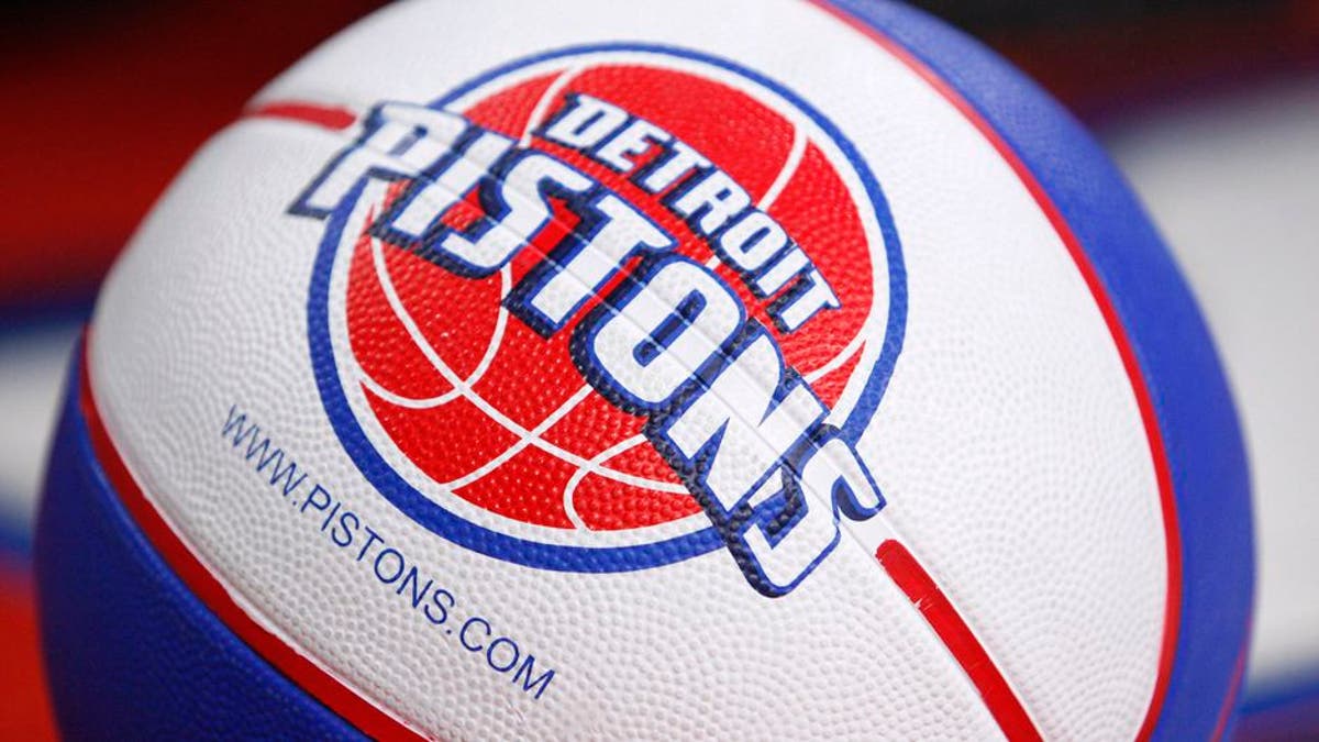
The Detroit Pistons unveiled a new primary logo Tuesday, but it probably looks a bit familiar. Its very similar to the one they used for nearly 20 years from 1979-96, during which they won two NBA titles.
This is the first time the Pistons have changed their logo since 2005, when they went completely away from the flaming horse and tailpipes.
The font and line weight are different in the updated look compared to the one used from 1979-96. Its cleaner, a bit simpler, and allows the red to stand out more in the background. A subtle touch is the chrome silver outline, which pays homage to the classic Detroit muscle cars.
Heres a detailed look at the new logo, which states that the same font will be used on the front of the teams' jerseys.
Overall, it's a welcome change. It's obviously simple, but the previous logo was a bit outdated with the massive drop-shadow font across the middle.


