


Coronavirus: First U.S. patient's doctor gives update, warning
Dr. George Diaz, Section Chief of Infectious Diseases at Providence Regional Medical Center Everett, gives an update on the first patient in the United States to contract the Wuhan coronavirus. Dr. Diaz explains how the virus is spread, incubation time, symptoms and warning signs.
Johns Hopkins University has put out a heat map in response to the public health emergency that updates the number of confirmed coronavirus cases across the world.
According to its website, the map was developed using data from WHO, CDC, China CDC, China National Health Commission and Dingxiangyuan – a website which reportedly aggregates data from Chinese government sources in “near real-time.”
CORONAVIRUS: WHO IS MOST AT-RISK?
As of Friday, more than 900 cases of coronavirus have been confirmed and 26 people have died from the virus, the map shows. The majority of the confirmed cases have been in mainland China with 916 sickened. However, dozens of cases in Illinois are under investigation after the Centers for Disease Control and Prevention confirmed a second case of coronavirus in the United States.
CLICK HERE TO GET THE FOX NEWS APP
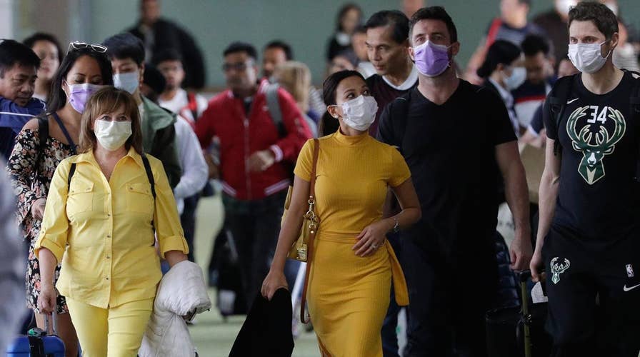
The novel coronavirus outbreak reportedly began at an animal and seafood market in Wuhan and has since spread to other countries. Authorities have confirmed the illness can be spread from human to human.
Most coronaviruses cause only mild symptoms, similar to that of the common cold. Other strains, such as Severe Acute Respiratory Syndrome (SARS) and Middle East Respiratory Syndrome (MERS), can cause pneumonia and death.
CLICK HERE TO SIGN UP FOR OUR LIFESTYLE NEWSLETTER
Symptoms of the virus include fever, cough and shortness of breath. There aren't many preemptive steps that can be taken to avoid infection, other than practicing basic sanitary measures on a regular basis.