


(MonotypeImaging)
Design fanatics spend a lot of time obsessing over fonts. They debate the readability of Times Roman, the 20th-century functionalism of Helvetica, the low-level IQ of Comic Sans. (Which has generated a hilariously profane response from Comic Sans itself.)
But discussion of typefaces is more than an academic exercise. From stop signs to newspapers, fonts affect the way that humans read and understand information.
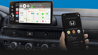
So, we weren't especially surprised to learn that researchers at Monotype Imaging and MIT's AgeLab have determined that typefaces employed by automakers on gauges and telematics screens have a direct effect on driver safety.
The study
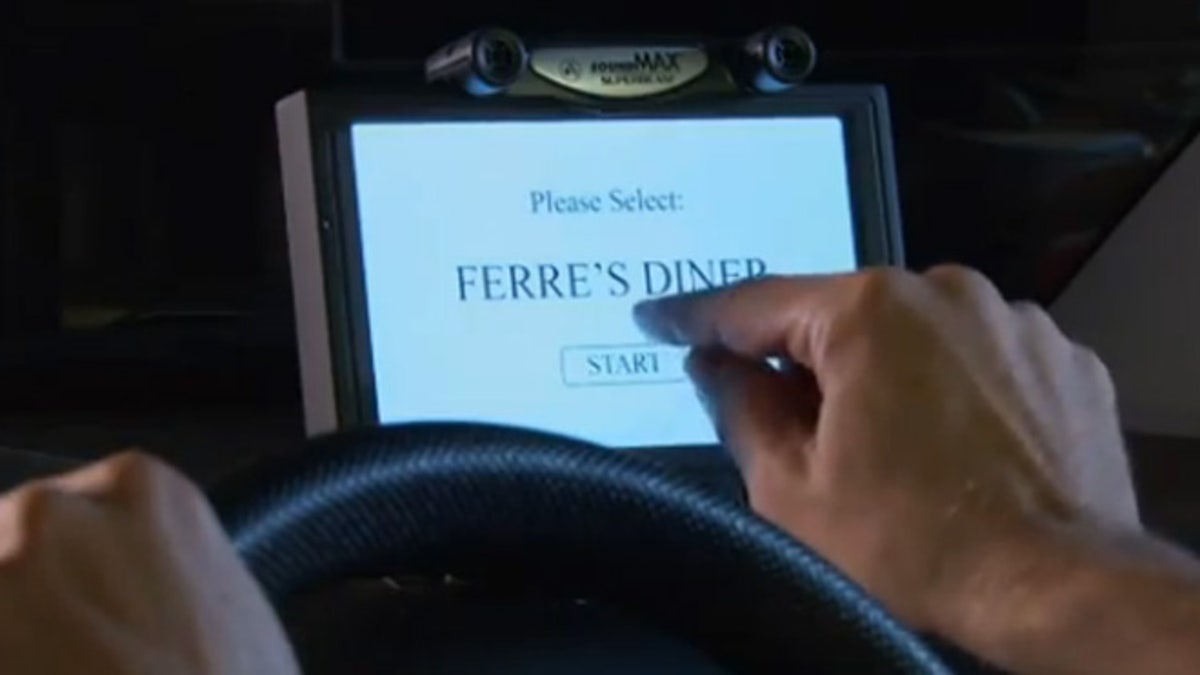
To gather their results, MIT and Monotype scientists put 42 people in a driving simulator. Participants ranged in age from 36 and 75 years old; half were men, half were women.
During the simulations, researchers measured the time that their human guinea pigs looked away from the road while checking the navigation screen for directions. Then, the Monotype/MIT team changed the font on the screen and asked each participant to take another drive in the test vehicle.
On one test drive, researchers set the touchscreen to use Eurostile, a "square grotesque" font. The other typeface was Frutiger, which falls in the family of "humanist" fonts.
Grotesques -- square or otherwise -- are popular among automakers because they have a consistent, modern, timeless look. Think of two of the most popular grotesques, Helvetica and its low-rent imitator, Arial: both are clean and simple, without much variation in thickness. Humanist fonts, on the other hand, can taper, and they often offer more variance between upper-case and lower-case letters.
Of the two, humanist fonts are typically considered easier to read because there's more differentiation in the letters -- and that's exactly what researchers found.
In fact, male test subjects had to spend 12% longer reading the square grotesque font than the humanist font. (For reasons yet to be explained, the gap was minimal among women.) At highway speeds, that 12% translates to a difference of 50 feet of roadway -- which, in turn, could be the difference between a safe trip home and a visit to the emergency room.
Confused by all that font talk? Have a look at this video clip, which explains the study in more detail (or check out a PDF from MIT here):
Could changing the font on our touchscreens cut back on traffic accidents? This study -- and another that verified its findings -- seem to indicate that's the case. (No pun intended.)