


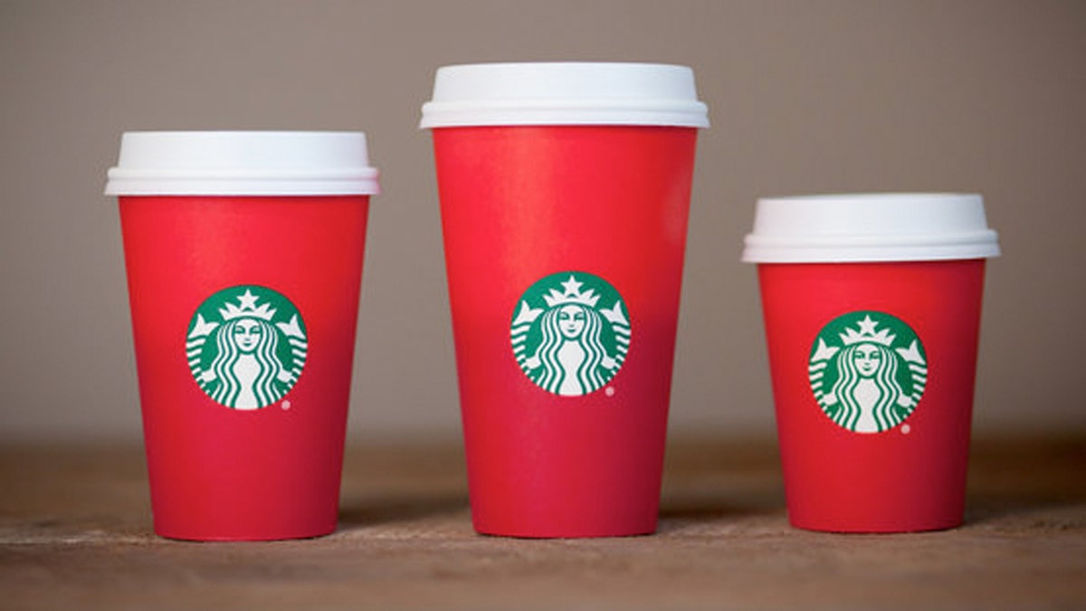
Starbucks' new holiday cup is has a simple red design devoid of the regular designs. (Starbucks)
On Sunday, Starbucks released its annual red cup, a container that represents the “official” start of the holiday season for a cult of caffeine addicts.
But this year, something is missing. Gone are the snowflakes, the swirls, the vintage ornaments and inspirational quotes that have traditionally adorned the tall, grande and venti cups holding your peppermint mocha and chestnut praline lattes.
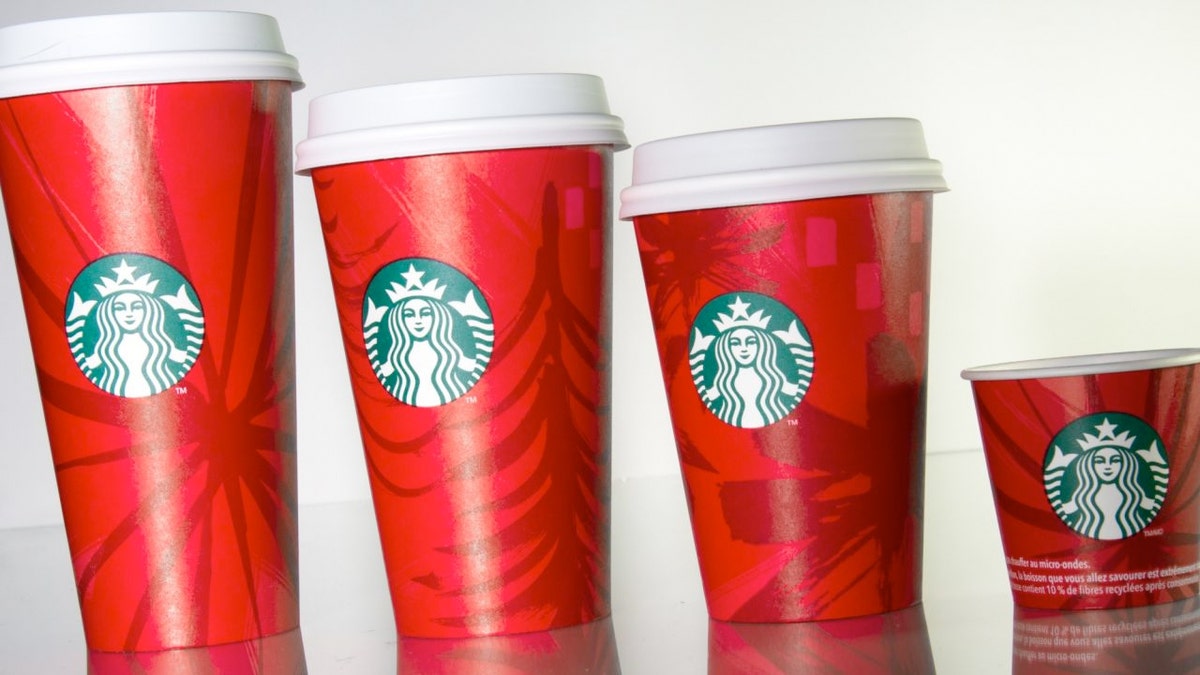
Starbucks 2014 holiday cup. (Starbucks)
This year’s cup has a minimalist design that features subtle shades of red and the Starbucks logo. According to Starbucks’ website, it was designed to “give people a piece of calm.”
"Starbucks has become a place of sanctuary during the holidays," Jeffrey Fields, Starbucks’ vice president of design, said in a statement. "We're embracing the simplicity and the quietness of it."
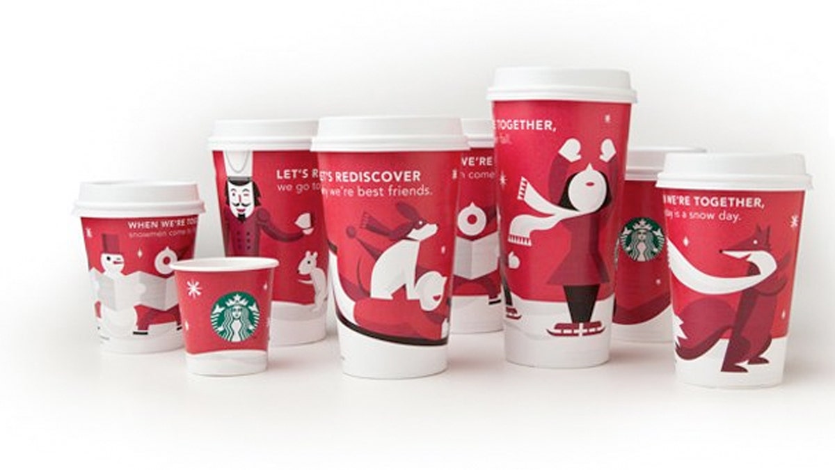
The red cup’s design depicts a different story each year, Starbucks spokeswoman Erin Shane told FoxNews.com. In past years it has presented vintage ornaments and hand-drawn reindeer. This year, it's about offering space to tell your own story.
"It can be literal, for example, as a blank canvas or it can be taken figuratively," she said.
But some fans have taken to social media to complain that this year’s red cup lacks festive cheer.
An article posted to Breitbart London even called the plain red cups part of the “War on Christmas.”
“This is a denial of historical reality and the great Christian heritage behind the American Dream that has so benefitted Starbucks," wrote Andrea Williams of the U.K.'s Christian Concern.
But not all Christian groups feel the same way. Paul Batura, vice president of communications at Focus on the Family, said snowflakes and carolers are not symbols of Christmas.
"I wonder if we’re not overthinking or overanalyzing this,” he said. “Christmas isn’t found in a cup or in a snowflake. Instead, it’s found in the hearts and minds of those of us who believe that God sent His only son to earth in the form of an innocent, helpless baby."
This isn’t the first time Starbucks has been attacked for its cup designs. In 2005, the company launched its "The Way I See It" campaign, printing quotes from notable figures on its cups. Some dealt with gay rights and religion, drawing anger from Christian and Muslim groups. The company quietly discontinued the campaign after two years. And just last March, Starbucks was forced to yank its controversial #RaceTogether campaign, which was intended to get people to talk about race, only days after launching it. Ken Nisch, chairman of the branding and retail design company JGA, says this year’s cup was carefully designed not to alienate or offend anyone. "It's not exactly Christmas,” he said, noting that the red cup conveniently matches nicely with the green logo. “It plays to people in the middle, because it’s something they would have all year around."
It’s hard to tell whether the cup’s simplicity will translate into more sales, Nisch said.
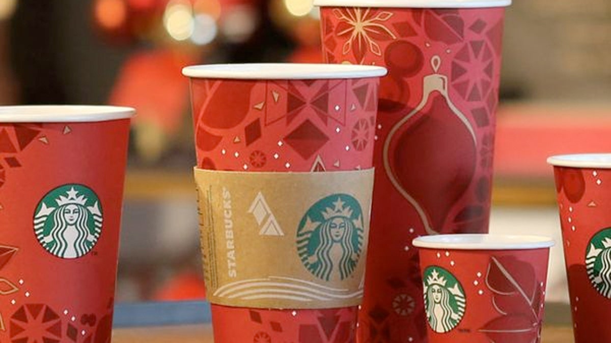
Starbucks 2013 holiday cup. (Starbucks)
"A good design helps sells things. I don’t think that the more you have on a cup necessarily helps sales, but most people are buying coffee, not the cup."
Shane said the red cups and their evolving design are a way to convey that the holiday season has begun. As for the critics, religious and otherwise, she says: "Everyone is entitled to their own opinion."
Starbucks 2012 holiday cup. (Starbucks)
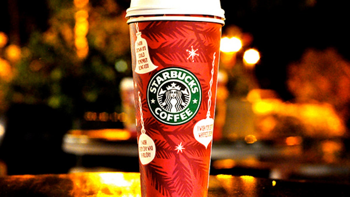
Starbucks 2011 holiday cup. (Starbucks)