Move Back
![Microsoft Pivot]() Microsoft Pivot, part of the company's Live Labs incubator program that releases novel new software, lets you drill through data, view bar charts, and filter on keywords. For example, you can research who has appeared on the cover of Sports Illustrated, then quickly see only bicyclists or swimsuit models.
Microsoft Pivot, part of the company's Live Labs incubator program that releases novel new software, lets you drill through data, view bar charts, and filter on keywords. For example, you can research who has appeared on the cover of Sports Illustrated, then quickly see only bicyclists or swimsuit models.![Digg Arc]() The Digg Labs Arc tool shows individual user activity -- which topics they are posting about, and how they relate to each other. For example, one user might post about a sports topic and then on tech.
The Digg Labs Arc tool shows individual user activity -- which topics they are posting about, and how they relate to each other. For example, one user might post about a sports topic and then on tech.![Digg_Swarm]() Like electrons around a nucleus, the Spy tool at Digg Labs shows small pop-ups for new topics, and then links them together according to who is "digging" a topic (or making it popular). This visualization helps you see how topic become popular -- who is posting about what and why.
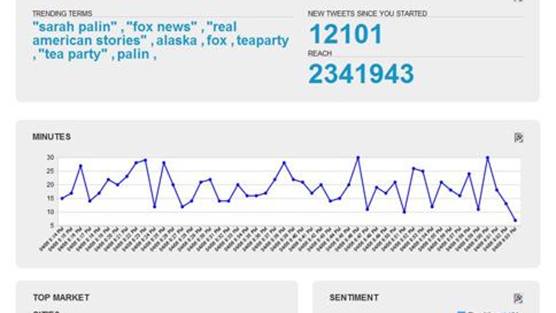
Like electrons around a nucleus, the Spy tool at Digg Labs shows small pop-ups for new topics, and then links them together according to who is "digging" a topic (or making it popular). This visualization helps you see how topic become popular -- who is posting about what and why.![trendrr.com]() Using Trendrr.com, you can see how people feel about a topic or buzz-worthy public figure such as Sarah Palin, according to all of the Internet commenters and blog postings about her.
Using Trendrr.com, you can see how people feel about a topic or buzz-worthy public figure such as Sarah Palin, according to all of the Internet commenters and blog postings about her.![Digg 360]() This visualization on Digg Labs, called 365, lets you select popular Web topics by date. Subjects rotate around an orb, with a pop-down menu for categories such as tech or sports. With this graph, you can find out what topics were popular on the Web during a certain month or for an entire year.
This visualization on Digg Labs, called 365, lets you select popular Web topics by date. Subjects rotate around an orb, with a pop-down menu for categories such as tech or sports. With this graph, you can find out what topics were popular on the Web during a certain month or for an entire year.![Digg Stacks]() The Stack tool, part of Digg Labs, shows Digg users as small dots falling down into a bar chart. The visualization shows which users are attracted to which topics, and why they are worth investigating.
The Stack tool, part of Digg Labs, shows Digg users as small dots falling down into a bar chart. The visualization shows which users are attracted to which topics, and why they are worth investigating.![Digg Spy]() DiggSpy is the Digg Labs tool for those who just want the basic headlines -- it shows falling blocks for popular topic, such as a recent bomb threat at a school and NASCAR trends.
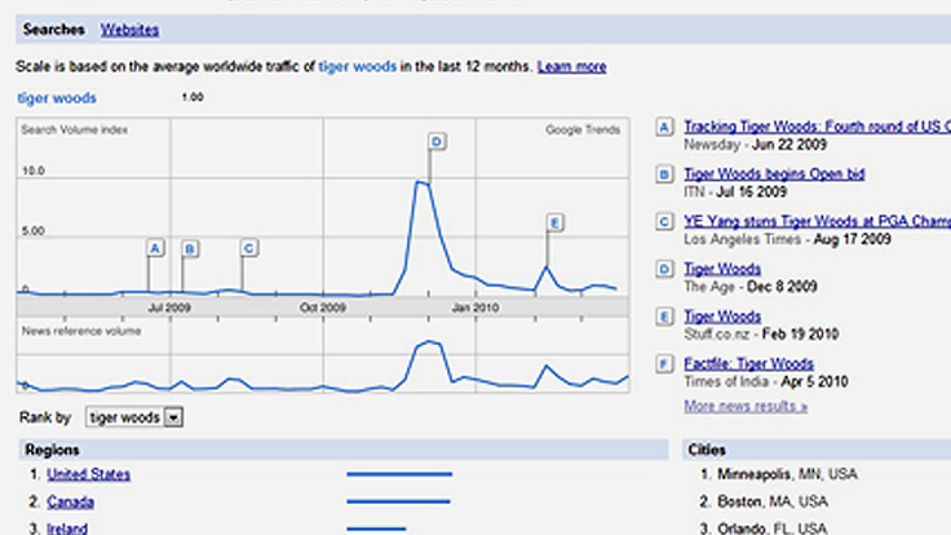
DiggSpy is the Digg Labs tool for those who just want the basic headlines -- it shows falling blocks for popular topic, such as a recent bomb threat at a school and NASCAR trends.![Google Trends]() Google Trends includes hot topics of the data, updated about once per hour, and is a fascinating peek into a wide range of subjects. You can use it to see the news of the hour.
Google Trends includes hot topics of the data, updated about once per hour, and is a fascinating peek into a wide range of subjects. You can use it to see the news of the hour.![Digg Pics]() The Pics tool at Digg Labs shows you a visual stream of the most popular images. You can click on an image to see a larger version or select an option to only see recently submitted pictures.
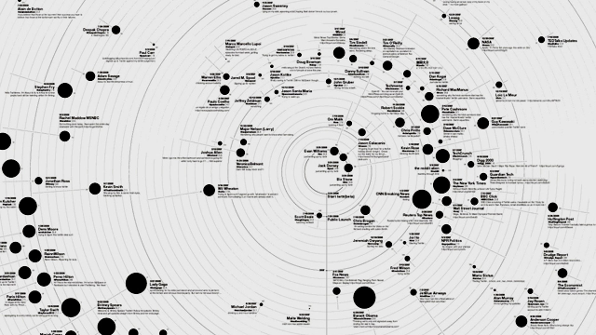
The Pics tool at Digg Labs shows you a visual stream of the most popular images. You can click on an image to see a larger version or select an option to only see recently submitted pictures.![Cosmic 140]() This cosmic chart shows the most popular Twitter users, including the three founders of the company, and how tweets are all about social networking-- the planetary links between users.
This cosmic chart shows the most popular Twitter users, including the three founders of the company, and how tweets are all about social networking-- the planetary links between users.The Pulse of the Web
Mesmerizing, flowing images and pulsing charts show who's talking about what on the Internet -- even which colors are popular this season. It’s literally the pulse of the Web.


Move Forward
- The Pulse of the Web


